I’m using the Howell1 data set from the Statistical Rethinking book. The data has 544 values of people’s heights and weights.

I built a bivariate linear regression with the weight as the predictor of height, and I used the natural logarithm of the predictor:
with pm.Model() as m_4:
    α = pm.Normal('α', 178, 100)
    β = pm.Normal('β', 0, 100)
    σ = pm.Uniform('σ', 0, 50)
    μ = pm.Deterministic('μ', α + β * np.log(df_all.weight))

    heights = pm.Normal('heights', mu=μ, sd=σ, observed=df_all.height)
    trace_m_4 = pm.sample(5000, tune=3000, njobs=1)
Resulting in:

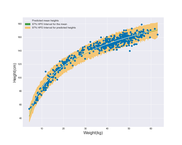
Or the same data, just visualized differently when I use the regular weights on the x axis:
This is visually very appealing. However, another way to reach a similar curve in the regression line was through the polynomial regression (second-order polynomial):
d.weight_std2 = d.weight_std**2

with pm.Model() as m_4_5:
    alpha = pm.Normal('alpha', mu=178, sd=100)
    beta = pm.Normal('beta', mu=0, sd=10, shape=2)
    sigma = pm.Uniform('sigma', lower=0, upper=50)
    mu = pm.Deterministic('mu', alpha + beta[0] * d.weight_std + beta[1] * d.weight_std2)
    height = pm.Normal('height', mu=mu, sd=sigma, observed=d.height)
    trace_4_5 = pm.sample(1000, tune=1000)
Resulting in:

Is there a rule of thumb about when to use the polynomial and when to use the logarithm of the predictor? (They both appear likely to overfit the data when sample size is small)
