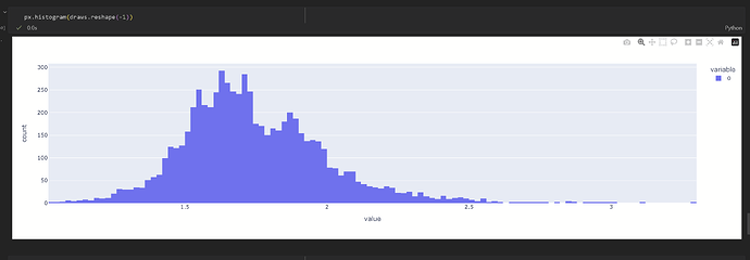
I’m trying to create a model where the prior is based on a real-world distribution that looks like this:
It’s tri-modal and none of the components are normally-distributed.
To get started, here’s what I tried so far just to model the left-most peak:
import pandas as pd
import numpy as np

import plotly.express as px
import pymc as pm

# Specify the model
with pm.Model() as model:

    # Prior for the location parameter
    mu = pm.Normal('mu', 0.53, 0.6)

    # Prior for the scale parameter
    sigma = pm.HalfNormal('sigma', 10)

    # Prior for the degrees of freedom parameter
    nu = pm.Exponential('nu', lam=0.1).round() + 1

    # Define the skewed Student's t-distribution
    skew_t = pm.SkewNormal('skew_t', mu=mu, sigma=sigma, alpha=-3)
    y_obs = pm.StudentT('y_obs', nu=nu, mu=skew_t, observed=np.array([.53, 0.54, 0.58, 0.57])

    # Sample from prior predictive
    prior_samples = pm.sample_prior_predictive(samples=1000)
What I’m finding is that to get the peak to be relatively lower compared to the rest of the distributions, I need to increase the standard deviation, which inevitably leads to more values being outside the range of possibility.
px.histogram(prior_samples['prior']['skew_t'].to_numpy().reshape(-1))
Is there another distribution that would be best that would satisfy the criteria:
1 - ability to specify skew
2 - ability to specify fatness of the tails
3 - ability to constrain the distribution so that it fits with the image
Perhaps you can use the histogram_approximation distribution from pymc-experimetnal?
You can also achieve approximate almost anything with a couple of mixtures. You can use optimization to find the best fit to marginals.
There’s an example of this in this blogpost (different application, but same principle): Simulating data with PyMC - PyMC Labs
Thanks, @cluhmann . Looking at the documentation, won’t we still have to specify a distribution to use in the dist argument?
@ricardoV94 , this is a very useful link.
I tried adapting the diamond distribution example to my use-case:
coords = {
    "components": (0, 1, 2),
    "obs": range(data.shape[0]),
}

with pm.Model(coords=coords) as m:
    # Priors for the weights, means and standard deviations
    mix_weights = pm.Dirichlet("mix_weights", np.ones(3), dims="components")
    mix_means = pm.Normal("mix_means", mu=[0.53, 0.54, 0.578], sigma=0.1, dims="components")
    mix_stds = pm.HalfNormal("mix_stds", sigma=0.1, dims="components")

    # Distribution of the data
    # We use numpy advanced indexing to broadcast the 5 mixtures parameters
    # and weights into the long form shape of the data
    ins = pm.Mixture(
        "ins",
        w=mix_weights,
        # You can pass a single distribution to Mixture,
        # in which case the last dimensions correspond to the mixture components.
        comp_dists=pm.LogNormal.dist(mu=mix_means, sigma=mix_stds),
        observed=data,
        dims="obs")

with m:
    fit = pm.find_MAP(include_transformed=False)
fit

draws = pm.draw(ins, draws=20, random_seed=10)
px.histogram(draws.reshape(-1))
However, the locations are skewed from what I specified, so something is off. Also, once I get this down, then how would I actually take those parameters for whatever distribution comes out and use them to specify a prior for my model?
After you fit, you have to redefine ins with the parameter values from find_MAP. Something like:
with pm.Model() as m:
  ins = pm.Mixture(
    "ins",
    w = fit["mix_weights"],
    comp_dists=pm.Lognormal.dist(mu=fit["mix_means"], sigma=fit["mix_sdts"]),
    shape=...,
)
Thanks for the clarification. So what you proposed gives me a distribution that’s realistic, but it looks quite far off what what I started with. The main problem is that it doesn’t exhibit the trimodal nature of the data, so likely doing something wrong.
with pm.Model() as m:
  ins = pm.Mixture(
    "ins",
    w = fit["mix_weights"],
    comp_dists=pm.Lognormal.dist(mu=fit["mix_means"], sigma=fit["mix_stds"]))

draws = pm.draw(ins, draws=1000, random_seed=10)

px.histogram(draws.reshape(-1))
3 additional questions:
- Is the problem that I actually need to specify another distribution initially that fits my data better rather than a LogNormal?
- I noticed you included a shape parameter in the suggestion, but I didn’t have a shape parameter in the specification, just dims. Maybe this is an issue.
- In the same vein, in the notebook example, they use all observations as one of the dims. Why is this necessary?
You might have had not enough data to learn more specific parameters, or your priors were too broad. It’s a modelling question on its own. Do look at what map is returning and see if the parameters make sense.
About your additional questions:
- Whatever you think makes sense. Can you have negative values? If so you can try Mixture of Normals
- The shape was because I wanted 5 draws by default (one from each component). But that was just for the example. You should use whatever shape you want for your final use as a prior in another model.
- Not sure what you mean. When the mixture is being fitted you want to use all the data you have to get a better fit. Once you fit it you can use whatever shape you want afterwards.
Yes, one of the 3 means from MAP doesn’t make sense, so that’s potentially the issue:
High-level, if the next step is ‘figure out what the appropriate distribution is of each subdistribution in the mixture’, then that brings me back to the original problem. I do see the value of this approach in that instead of trying random parameters, I can specify a distribution with some priors and then if the result fits the data, I can use that. However, specifying the different component distributions is the part that’s stumping me.
On the other answers:
- No, we cannot have negative values, but LogNormal is taking care of that (although as we see above, one of the components has a negative value).
- Ok, clear on that, I understand this doesn’t really make a difference whether I specify the shape or not in terms of plotting the combined distribution.
What’s interesting is that despite the negative mean from above, when I plot the result with shape, that negative mean goes away.
- If you refer to the example from the link you sent, they are specifying the length of the df as one of the dimensions. Why do you need to do this in order to use all the data?


