Refer to Budget Allocation example notebook.
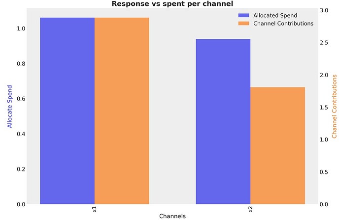
The “Response vs spent per channel” bar chart for 2M budget (screenshot attached)
shows a total of about 2.75M (x1) + 1.75M (x2) = 4.5M total contribution.
However, the corresponding “Comparison of Optimized and Initial Budget Responses” line chart shows an Optimized Response that’s more than 6.75M and goes higher than that in the next few weeks (screenshot attached)
.
Here are my queries:
- How can the Optimized Response start at 6.75M and go upwards while the sum of individual channel contributions is just 4.5M? Does the Optimized Response include the Base + Control contributions also (beyond only the channel contributions)?
- Why does the Optimized Response go upward over time? Is it because of the adstock effect? If that’s the case, then the Optimized Response is not for one-time budget investment, rather it is for weekly investment during the campaign period cumulatively. Is this understanding correct?
The scale of the contributions in on the right side in yellow, although it’s still smaller.
I think you’re correct about point 2.
@juanitorduz or @cetagostini will be better posed to confirm.
Yes, I understood that, but somehow I made mistake during adding them up.  I’ve now edited my original post to reflect this. It is still totaling up to 4.5M which is still lower than 6.75M. So, could you please kindly explain my question #1?
This discrepancy is not limited to these graphs alone. It is everywhere in the example notebook mentioned. So, it would be helpful if you could explain.
Hello!
This happens because the default function includes adding previous observations (include_last_observations=True) when performing a predictive posterior sample. So, the daily effect given your spend is 4.5 units, but it has an Adstock from previous days of 2 units. Therefore, your effect on day 1 of the new budget is what the optimizer says plus adstock from previous days. Additionally, adstock is also generated on the optimization days. Day 1 will generate a direct impact of 4.5, but an indirect impact of 11 on days 2, 3, 4, 5, 6, 7, etc., so this also creates a difference.
Fundamentally, the bar chart tells you the value of the daily impact on each channel; this doesn’t reflect the temporal dynamics, which you can see in the time series plots 
@kb-open

