Hi every one:
I have created a Dirichlet mixture binomial model using PyMC5. The posterior predictive mean in az.plot_ppc seems to fit the observations well. However, the plot showed significant differences when I computed the posterior predictive mean using code similar to idata.posterior_predictive['var_name'].mean(dim=["chain","draw"]) . As a result, the posterior predictive mean obtained was different. How can I obtain the same posterior predictive mean as the one generated by az.plot_ppc ?


below was my code
ad_ar = np.array([ 80., 185., 189., 71., 66., 121., 131., 65., 135., 176., 49.,
111., 91., 100., 178., 72., 135., 83., 130., 75., 180., 160.,
65., 193., 50., 82., 118., 123., 161., 183., 211., 119., 206.,
57., 173., 58., 134., 89., 138., 147., 162., 186., 125., 81.,
163., 116., 112., 77., 105., 207., 161., 158., 53., 61., 157.,
79., 121., 152., 113., 111., 179., 75., 83., 78., 161., 134.,
205., 86., 67., 90., 133., 146., 127., 170., 152., 65., 126.,
73., 56., 149., 187., 173., 57., 146., 78., 186., 173., 136.,
220., 159., 169., 139., 162., 67., 54., 113., 128., 156., 88.,
198., 134., 194., 63., 145., 200., 152., 214., 144., 171., 177.,
64., 87., 58., 154., 84., 80., 163., 192., 63., 167., 83.,
85., 51., 73., 78., 119., 139., 192., 96., 69., 153., 139.,
165., 160., 120., 129., 164., 239., 114., 90., 140., 87., 131.,
60., 130., 70., 89., 105., 70., 86., 93., 132., 176., 70.,
148., 66., 55., 138., 60., 184., 127., 144., 71., 158., 183.,
136., 72., 102., 185., 146., 128., 134., 161., 83., 135., 69.,
104., 141., 193., 85., 197.])
dp_ar = np.array([190., 185., 189., 151., 124., 231., 131., 118., 136., 176., 113.,
204., 161., 213., 179., 146., 135., 160., 130., 146., 180., 160.,
135., 193., 133., 160., 118., 254., 161., 183., 211., 119., 206.,
117., 173., 113., 134., 157., 138., 147., 162., 186., 125., 182.,
163., 116., 112., 155., 105., 207., 161., 158., 114., 120., 158.,
162., 121., 153., 113., 111., 179., 142., 162., 157., 161., 134.,
206., 164., 145., 197., 133., 146., 127., 172., 152., 153., 126.,
162., 127., 149., 188., 173., 125., 146., 152., 186., 173., 136.,
220., 159., 169., 140., 162., 140., 119., 113., 128., 156., 173.,
198., 134., 194., 138., 145., 200., 153., 215., 144., 171., 178.,
116., 174., 130., 154., 175., 157., 163., 192., 131., 167., 161.,
145., 117., 156., 153., 119., 139., 192., 182., 156., 153., 139.,
165., 160., 120., 129., 164., 239., 115., 178., 140., 161., 132.,
132., 130., 145., 166., 105., 149., 167., 187., 132., 177., 149.,
148., 151., 153., 139., 138., 184., 127., 145., 171., 158., 184.,
136., 139., 183., 185., 146., 129., 134., 161., 199., 135., 132.,
104., 141., 193., 156., 197.])
K = 20
N = ad_ar.shape[0]
b = get_beta_param(vaf_ar.mean())
with pm.Model(coords={"component": np.arange(K), "obs_id": np.arange(N)}) as model:
alpha = pm.Gamma("alpha", 1.0, 1.0)
cond = alpha>1
alpha_constrained = pm.Potential('alpha_constrained',pm.math.log(pm.math.switch(cond, 1, 0)))
beta = pm.Beta("beta", 1, alpha, dims="component")
w = pm.Deterministic("w", stick_breaking(beta), dims="component")
p = pm.Beta("p",1,1,dims="component")
obs = pm.Mixture(
"ad", w, pm.Binomial.dist(n=dp_ar.reshape(-1,1),p=p), observed=ad_ar, dims="obs_id"
)
########## plot
ppc = trace.posterior_predictive["ad"]
ppc_mean = ppc.mean(dim=["chain","draw"])
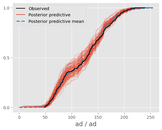
az.plot_ppc(trace,var_names="ad",num_pp_samples=100)
az.plot_ppc(trace,var_names="ad",num_pp_samples=100,kind="cumulative")
az.plot_ppc(trace,var_names="ad",num_pp_samples=100,kind="cumulative")
ax = sns.kdeplot(ppc_mean,color="blue")
sns.kdeplot(trace.observed_data["ad"].values,color="red")
ax = sns.ecdfplot(ppc_mean,color="blue")
sns.ecdfplot(trace.observed_data["ad"].values,color="red",ax=ax)