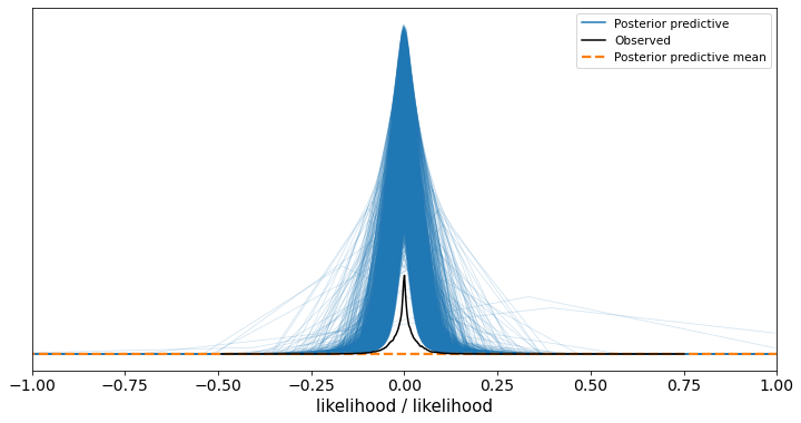
The posterior mean line looks to be completely flat along the bottom of the Y axis and doesn’t look to relate to any of the samples at all, why is this?
Potentially related - if I don’t set any axis arguments I get the following:
Which I think is expected, because my outputs are continuous variables where the expected mean is often very close to zero but I have outlier results (I’m doing Student-T regression with hierarchical intercepts for each of my groups) so sometimes I can have large observed values / very small predicted values.
Thanks in advance for any help explaining what’s going on!
With some more investigation the extreme sampled values just looks to be a function of the Student T that’s learned, e.g. this code (where I’ve just manually put in the mean values from my fitted model) produces the following:
with pm.Model() as studentt:
    likelihood = pm.StudentT("likelihood", nu=1.982, mu=0,
                             sd=0.018, observed=ev_k_m0)
    studentt_ppc = pm.sample_prior_predictive()
    import matplotlib.pyplot as plt
    fig, ax = plt.subplots(figsize=(12, 6))
    plt.xlim(-1, 1)
    az.plot_ppc(az.from_pymc3(posterior_predictive=studentt_ppc, model=studentt), ax=ax)
Which is surprising to me, because the real data doesn’t have any values outside of -1/+1, but that’s just a model mis-specification issue. I’m guessing the graphing issues (the area-under-the-curve for the observed and the posterior samples not matching, the posterior mean line being flat) are related to the x axis being unexpectedly wide?
Perhaps this should really be a feature request for plot_ppc to take some bounds parameters for the x axis as an optional argument?
My suspicion is that the kernel density estimate of the mean is using a bandwidth that is too wide to show you any evidence of the non-zero values within that very narrow window. You can already see that the blue “curves” are basically just a couple of straight lines, suggesting that even when plotting the predictions for an individual sample it is struggling to illustrate this tiny bump in the predictions. If you want to check this out, you can use calculate the means of studentt_ppc by hand and then use az.plot_kde() to plot them, tweaking the bw argument to see if you can get the bump to show. Or you can just plot the raw means.
Yes I think you’re right it’s just a graphing artifact due to my long tailed distribution being so wide I’m likely to get some extreme samples on both tails with 150,000 (my data points) x 4000 (my trace samples) total posterior samples. If I clip my predictions to my actual data domain (-1, 1) then the graph looks fine:
Do you think it’d be beneficial to support an optional x axis bounds parameter for the plotting call to handle cases where the distribution sample range is much wider than the bulk of the probability mass, or is it better to just let the users do some data clipping like I did? The most helpful graph to me was when I clipped even further to just -0.1 / +0.1
I will let @OriolAbril address changes to the arviz API, but I think the orange posterior[prior] predictive mean KDE plot is actually a pretty good summary of the posterior[prior] predictions, even in this scenario. I think it’s always going to be a challenge to illustrate all possible aspects of a set of predictions. This is part of the reason that I often prefer to generate prior/posterior predictions “by hand” (using the sampled values in my trace) and then interrogate the predictions myself. That way, I can decide exactly what aspects of the predictions I care about (e.g., predicted values near the mode) and which ones I don’t (e.g., the tails).
Both plots are exactly the same. The only difference is that in the first you set plt.xlim(-1, 1) so instead of seeing the matplotlib default limits (dependent on data) you see -1, 1 as limits. This also relates to the next question.
I don’t think so. plot_ppc returns a matplotlib axes (or array of matplotlib axes) and you can do whatever you want with that. I don’t think it makes sense to add uncommon arguments that have a 1-to-1 relation with matplotlib commands.
Moreover, the main goal of plot_ppc is to compare posterior predictive distributions to observed ones, to make sure they look similar. By doing this clipping, you are seeing results that don’t show the reality of the model “badness”. The model is so overdispersed that the default KDE bandwidth can’t be low enough to capture the hyper concentrated around 0. The clipped version still shows that but to a much lesser extent.
I recommend you very strongly to perfom the conversion once, store it and then use that for plotting. This will also allow you to inspect the generated inferencedata and make sure the conversion actually worked (i.e. there might be a mismatch between chain or draw dimensions for example that also affects the plot).
I see very little (if any) difference between this manual plot and the first image with the default plot_ppc output and plot x axis limits set to -1, 1.
The graphing issues are related to two issues. The first one is the KDE itself, the other is the grid of x values used for plotting.
The kde tries to estimate the density from the available points and (by default) assumes that the spread of the distribution (of of the different modes if multimodal) is constant. This doesn’t seem to be the case here.
Moreover, we use a finite set of x points to plot, so even if the kde estimation generates a continuous function (with continuous derivative), if the range is too big and the changes too pronounces the plot doesn’t look continuous but as a sequence of connected straight lines (which it always is even if it is generally not noticeable).
The exact same algorithm is used for the blue kdes and for the orange one. The only difference is that the blue ones use data from a single draw, whereas the orange one uses the samples from all draws at the same time. The fact that the orange one looks so different from the blue ones is also informative. It indicates that the effect of long tails yet most density concentrated around 0 becomes more significant with more samples (making it increasingly difficult for the kde algorithm)
I don’t know if you need a mixture or something more in the style of a Laplace distribution, but it’s clear that the student-t is no able to reproduce the high concentration around 0 combined with longish tails at the same time.
Thank you very much @cluhmann and @OriolAbril for your quick replies! I think I understand better what’s going on now.
Sorry I should have clarified that it was more to be able to force the KDE to operate on a subset of the full x axis range to workaround the graphing issues you mentioned when I just naively apply the matplotlib axis limits so that I’m able to visualise the core of the probability mass. However, given there’s a fairly simple workaround (clip or drop the extreme values like I did, then do the graph) and also the issue with the model is fairly apparent anyway (the tails are far too big!) then I agree it’s not worth an API change.
Indeed switching to the Laplace distribution improved the tails behaviour considerably, thanks for the tip!
We need to expose the arguments that modify how the KDEs are computed and we do have an issue open for this Update functions using KDE to pass optional arguments · Issue #1316 · arviz-devs/arviz · GitHub, so you can use adaptive bandwidth which should work better for cases like this, or also increasing the number of gridpoints (which will make things much slower but show smoother results). But I think the defaults are quite well chosen, not sure if it’s just me due to being more familiar with the algorithm, but I get the most information from the two intial plots you posted which reduce to default plot_ppc in interactive mode plus zooming in at the center or running it a couple times manually setting the y lims afterwards
Yes I think it’s been resolved, thanks very much! That new feature to modify the KDE arguments seems like it’d be a cleaner way to resolve a similar issue in the future, and if the docs explain to those less familiar with how it works understand why they might need to change those values (eg seeing straight lines in the posterior samples) then I think there’s a good chance I’d have had a go tweaking those first and resolved it that way instead.
Thanks again for the assistance - I’m a huge Arviz fan already