Edit: PYMC3 implementation is here: https://github.com/ColCarroll/simulation_based_calibration
Hi @gbernstein,
I have followed your above instruction and below is the results (M = 1028).
- Could you please let me know if it looks reasonable?
- How would I interpret the outcomes of the KS test (D statistics and P-value)?

And here is the ECDF:

- The above results are when I chose HalfGaussian Priors for my parameters. However, when Uniform Priors are chosen the U_i distribution looks “less” uniform. My naive conjecture is that HalfGaussian Priors are “better” suited for my problem than Normal Priors. Is that reasonable? FYI: below are results from Uniform Priors:


At the risk of sounding stupid (so please correct me if I’m wrong): my reading of the paper is that, if you’ve implemented the data sampler for p(\mathrm{data}|\theta) correctly, the data-averaged posterior should match the prior regardless of the particular prior; and any divergences suggest either a problem with the data sampler or with the likelihood (monte carlo) sampler (or both).
Even though the paper describes that calibration plot as evidence of left-skew (under-estimation: clearly visible in the quantile-quantile plot), my first check would be the traces to see if there are autocorrelations or divergences in the sampler; and if so to tune for a bit longer and to potentially thin the trace.
Possibly? The paper isn’t really clear enough for me to figure that out.The intro text says
Consequently, any discrepancy between the data averaged posterior (1) and the prior
distribution indicates some error in the Bayesian analysis.
and Theorem 1 says
\pi(θ | \tilde{y}) for any joint distribution \pi(y, θ)
but it’s not explicitly stated it should work for any arbitrary prior so I’m not sure.
Agreed regarding checking out the traces as a useful tool. It can help make sure your method is sampling properly, though you can’t tell from looking a single trace if the method is properly calibrated.
-
I haven’t used SBC in practice but the histogram looks reasonable. I’d recommend plotting it with the gray band like they have in Figure 1 and 2 to determine if you’re observing an acceptable amount of variance in the bins. The QQ plot looks pretty good, though you can tell there’s a super slight S-curve to the orange line indicating slight miscalibration (either the posterior is too tight or too disperse, depending on how you assigned the X and Y axes.
-
I don’t think a single KS statistic alone is enough to determine anything. Are there any baselines you know should be perfectly calibrated you can compare against? E.g. in the privacy paper I linked above I compare the private methods (which have to deal with a lot of noise) to the non-private method which has exact data and should therefore always be calibrated.
-
Agreed. There’s an interesting blip at 1, indicating the posterior’s mass is too often to the left of the true parameter, so it’s biased for some reason. Whereas the Half-Gaussian prior seems centered properly but either too wide or too narrow (depending on how you plotted it). As @chartl noted, looking at the trace would be helpful, as would a histograms of the posterior samples over multiple trials.
Thanks a lot for the feedback, @gbernstein. Just to clarify that I am using Cook’s method to obtain the results shown here not SBC.
@chartl: I will look at the traces to see if there is any sign of autocorrelations or divergences.

- Do you know how or is there any python function that can calculate and plot the “gray band” as seen in Figure 1 and 2 and panel (a) above?
- Similarly, do you know how to plot the panel (b) and ©? what are “gray band” in the panel b and c? What is the “red line” in the panel c.
- I think this is a trivial question but from your experience, what is the “optimal” number of bins to plot if I have a round 1000 samples? How do you choose number of bins given certain number of samples.
Thanks a lot for your help, I really appreciate that!
As far as I can tell, the grey band in (a) is a confidence interval for the uniform bin. So for instance
import numpy as np
import matplotlib
from matplotlib import pyplot as plt

N = 250
#x = np.random.uniform(size=N)
x = np.random.beta(1.22, 1, size=N)
K=10
bins = [i/K for i in range(K+1)]
hist = np.histogram(x, bins)
expected = N/K
sd = np.sqrt((1/K) * (1-1/K) * N)
# 95% CI
upper = expected + 1.96 * sd
lower = expected - 1.96 * sd
midpoints = [(i)/(2*K) + (i+1)/(2*K) for i in range(K+1)]

plt.fill_between(x=hist[1], y1=[lower]*(K+1), y2=[upper]*(K+1), color='#D3D3D3')
plt.bar(x=midpoints[:-1], height=hist[0], width=1/(K), color='#A2002566')

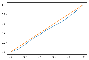
The ECDF is just a transformation on the histogram:
import scipy as sp
import scipy.stats
ecdf = np.cumsum(np.array([0] + (hist[0]/N).tolist()))
ecdf_mean_unif = np.array([i/K for i in range(K+1)])
plt.plot(hist[1], ecdf)
plt.plot(hist[1], ecdf_mean_unif)
plt.figure()
# or, for the step look
bin_edges = [y for x_ in hist[1][1:-1] for y in (x_-1/(100*K), x_+1/(100*K))]
chist = np.cumsum(hist[0])
bin_values = [y/N for i_ in range(1, len(hist[0])) for y in (chist[i_-1], chist[i_])]
bin_expected_values = [y/K for i_ in range(1, len(hist[0])) for y in [i_, i_+1]]
bin_lower_unif, bin_upper_unif = list(), list()
for i_ in range(1, len(hist[0])):
    p1 = i_/K
    p2 = (i_+1)/K
    j = int(p1*N)
    bin_lower_unif.append(sp.stats.beta.ppf(0.025, j, N+1-j))
    bin_upper_unif.append(sp.stats.beta.ppf(0.975, j, N+1-j))
    j = int(p2*N)
    bin_lower_unif.append(sp.stats.beta.ppf(0.025, j, N+1-j))
    bin_upper_unif.append(sp.stats.beta.ppf(0.975, j, N+1-j))
plt.plot(bin_edges, bin_values)
plt.plot(bin_edges, bin_expected_values)
plt.fill_between(x=bin_edges, y1=bin_lower_unif, y2=bin_upper_unif, color='#D3D3D366')
# delta plot
plt.figure()
delta = np.array(bin_values) - np.array(bin_expected_values)
del_lower = np.array(bin_lower_unif) - np.array(bin_expected_values)
del_upper = np.array(bin_upper_unif) - np.array(bin_expected_values)
plt.plot(bin_edges, delta, color='#A20025')
plt.fill_between(x=bin_edges, y1=del_lower, y2=del_upper, color='#D3D3D366')


If you’re wondering where the beta distributions come from, see https://en.wikipedia.org/wiki/Order_statistic#Order_statistics_sampled_from_a_uniform_distribution


To show what a deviation from expectation would look like.