Hello,
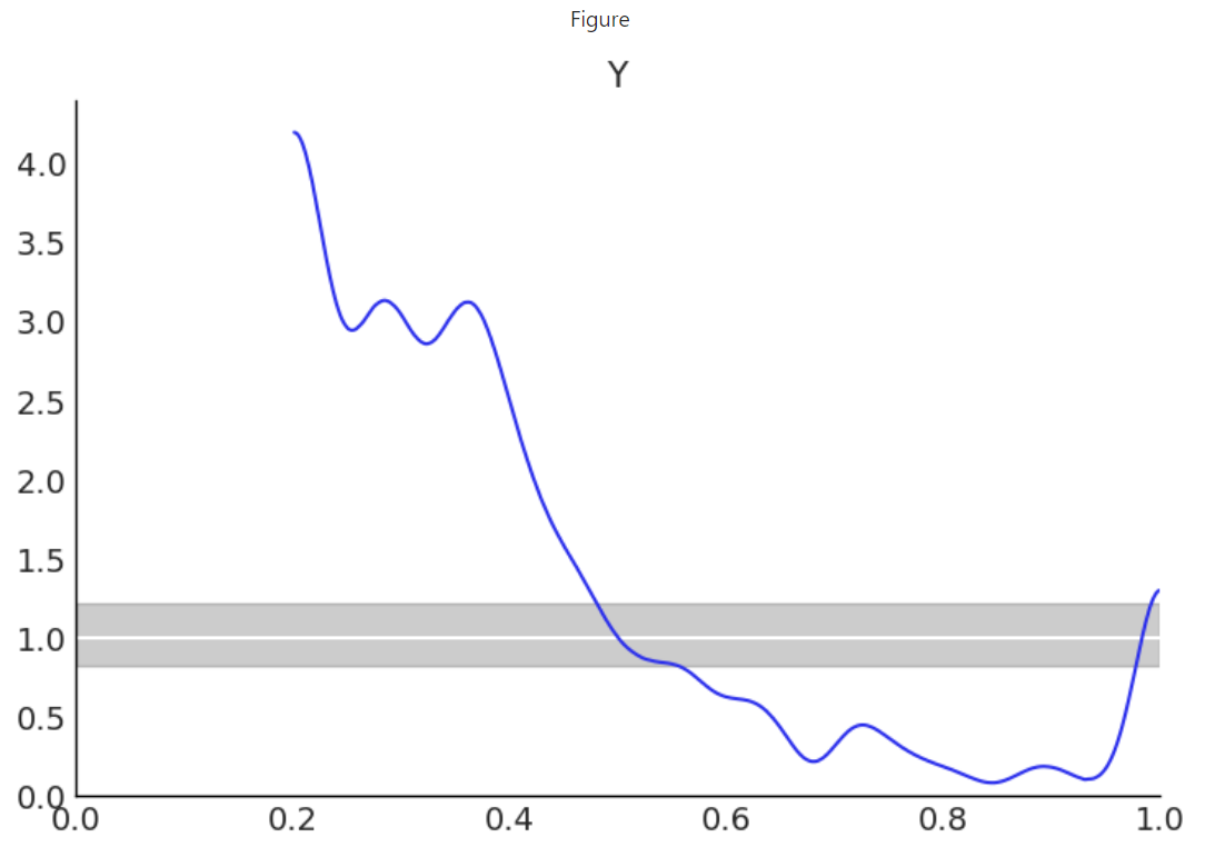
I’m pretty new to Bayesian modeling and the PyMC world. I’m trying understand the graph produced by Arviz’s plot_bpv() shown below. Specifically, I don’t understand the domain of the plot. I understand that the u-value plot is in reference to a uniform distribution spanning [0, 1]. What I don’t understand is how the predicted posterior distribution Y is scaled to this domain. Is it simply that 0 and 1 represent the min & max sampled values from posterior? If so, why does the blue line not show any values in [0, 0.2]?
Furthermore, are there some blog posts or other resources which go in detail about each of Arviz’s Model Checking functions? I’d like to understand the strengths and weaknesses of these functions. Thanks for your help!
The “u_value” kind plot checks p_i := p(y_i* \leq y_i | y), as indicated in the docs: arviz.plot_bpv — ArviZ 0.18.0 documentation.
That is, we first loop over each individual observation, and check, out of all the posterior predictive samples for that observation, what percentage is smaller than the actual observation. Once we have done that we have one number between 0 and 1 per observation, which we treat as samples of a distribution. Moreover, if the posterior predictive follows the same distribution as the actual observations we are doing a probability integral transform which tells us those samples should be uniformly distributed.
In the plot above these samples arw clearly not uniformly distributed which means the model you have can’t be the one that generated your observations.
Also as indicated in the docs, this is very similar to the LOO-PIT check, and has the same interpretation. I wrote a blog post a while ago about loo pit and its interpretation: LOO-PIT tutorial — Oriol unraveled. We are currently working on the doc you ask for, so it doesn’t exist and it would be helpful to get extra input on what is clear and what isn’t. Do you mind discussing your interpretation of the plot in this thread?
Thanks @OriolAbril for your thorough reply! Your explanation answered my original questions regarding the domain of the plot. Reading your blog post also helped and I went and watched a few short explanations about the probability integral transform also. So here’s how I would answer my own original questions with what I’ve learned:
- How is the domain of the u-value plot determined? Answer: This plot transforms the predicted posterior to a uniform distribution (hence the values are “u-values” or “uniform values”). The uniform distribution by definition spans [0, 1].
- What do the values of 0 and 1 correspond to? Answer: 0 corresponds to the zero-th percentile of the observed data, AKA the minimum value. 1 corresponds to the 100th percentile of the observed data, AKA the max.
- Why is there no data plotted in the [0, 0.2] domain? Answer: The predicted posterior does not produce values smaller than the ~20th percentile of the observed data.
Below I’ve shared the corresponding LOO-PIT plot for my predicted posterior. Based on your blog post I can see that my posterior is under dispersed because it is concave and biased because most of the mass is negative.
I’m happy to discuss these plots further if you have specific questions. Thanks again for your help!